
EA strip chart, also known as a strip-chart recorder, is a device used for the continuous graphical recording of time-dependent data on a long strip of paper. This type of chart records various inputs, such as temperature or pressure, over time, allowing for the visualization of trends and fluctuations in the data. The recording is typically done using a pen that moves across the paper as data is collected, making it useful in various fields such as engineering, environmental monitoring, and medical diagnostics. Strip charts have largely been replaced by digital data logging technologies but are still valued for their simplicity and effectiveness in certain applications .
Why Strip Charts Matter in Data Analysis
Strip charts hold significant value in data analysis due to their ability to present data in an easy-to-understand format. They enable analysts to track changes over time, identify cyclical patterns, and detect outliers that might warrant further investigation. In fields such as medicine, finance, and environmental science, strip charts can be the key to uncovering critical insights that drive decision-making processes. The simplicity and clarity of strip charts ensure that even complex data is accessible and interpretable by a broad audience.
Key Elements of Strip Charts
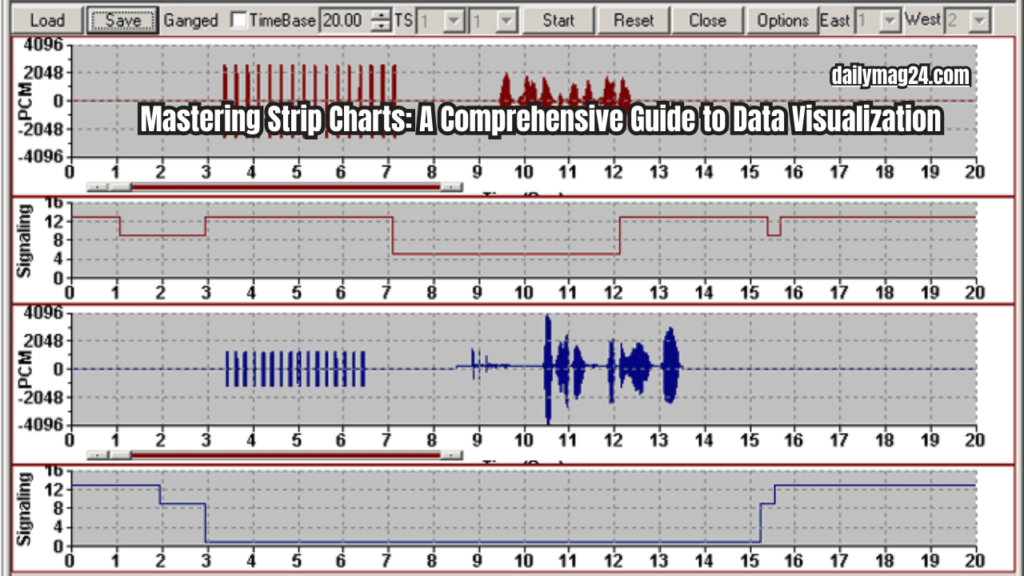
A well-constructed strip chart comprises several fundamental elements. The axis is one such element, with the horizontal axis typically representing time, while the vertical axis shows the variable being measured. Data points are then plotted along the axes, forming a line or series of dots. Clear labels on axes and data points are essential for accurate interpretation, and grid lines assist in reading data points more precisely. In cases where multiple datasets are plotted, a legend distinguishes between different series. Understanding these components is crucial for both creating and interpreting strip charts effectively.
Steps to Interpret Data on a Strip Chart
Reading a strip chart involves several steps. First, identify the axes to determine what each axis represents, with the x-axis typically denoting time and the y-axis indicating the variable being measured. Next, examine the scale of the axes to understand the range and intervals of the data. Analyze the individual data points to see how the variable changes over time, and then detect any recurring patterns, trends, or cycles within the data. Lastly, note any data points that deviate significantly from the rest, as these may indicate anomalies or errors. By following these steps, one can gain meaningful insights from a strip chart.
Common Uses in Various Fields
Strip charts are versatile and find applications in numerous fields, including healthcare, finance, environmental science, manufacturing, and education. In healthcare, for instance, strip charts are used to monitor patient vitals over time, while in finance, they track stock prices or economic indicators. Environmental scientists use them to observe changes in climate data, manufacturers record process performance metrics, and educators analyze student performance trends. These applications demonstrate the broad utility of strip charts in both professional and academic settings.
Benefits for Data Visualization
The advantages of using strip charts for data visualization include their simplicity, ease of interpretation, trend identification, and versatility across various fields. Strip charts are easy to create and interpret, making them accessible to non-experts. They are excellent for spotting trends and patterns over time and allow for the comparison of multiple datasets on the same chart. Their applicability to a wide range of fields and data types further underscores their value in data visualization. These benefits make strip charts a preferred choice for many analysts and researchers.
Different Varieties and Their Uses
There are several types of strip charts, each suited to different purposes. The single line strip chart shows one dataset and is ideal for simple time series analysis. The multiple line strip chart allows for the comparison of multiple datasets simultaneously, while the colored strip chart uses color to differentiate data points or categories. The logarithmic strip chart plots data on a logarithmic scale, making it useful for data with large ranges. Understanding the various types of strip charts helps in selecting the most appropriate format for specific data visualization needs.
Step-by-Step Guide to Making Strip Charts
Creating a strip chart involves gathering the data you wish to plot and then choosing a tool or software for creating the chart, such as Excel, R, or Python. Input the data into the selected software and use its charting features to plot the data points on a strip chart. Customize the chart by adding labels, legends, and adjusting the appearance for clarity. Finally, analyze the strip chart to extract insights and conclusions. Following these steps ensures a clear and effective strip chart for data analysis.
Best Software and Tools for Strip Charts
Several tools are popular for creating strip charts, including Microsoft Excel, R, Python (using libraries like Matplotlib and Seaborn), Tableau, and Google Sheets. Microsoft Excel is user-friendly and widely accessible, making it suitable for basic strip charts. R is a statistical software offering advanced plotting capabilities, while Python provides robust strip chart functionalities through its libraries. Tableau is a powerful data visualization tool for creating interactive strip charts, and Google Sheets is a free and accessible option for simple strip charts. Choosing the right tool depends on the complexity of the data and the desired features of the strip chart.
Differences and When to Use Each
While strip charts and line charts might appear similar, they serve different purposes. Strip charts are typically used for discrete data points, ideal for smaller datasets or when highlighting individual observations. Line charts, on the other hand, connect data points with lines, making them suitable for continuous data and larger datasets. Understanding these differences helps in selecting the appropriate chart for specific data analysis tasks.
Tips for Effective Strip Chart Usage
To maximize the effectiveness of strip charts, consider the following tips. First, keep it simple by avoiding cluttering the chart with too many data points or series. Use clear labels to ensure that axes and data points are easily readable. Highlight key data by using colors or markers to emphasize important data points. Maintain consistency by using consistent scales and formats for easier comparison. Finally, review the chart regularly and update it to reflect new data. Implementing these best practices ensures that strip charts remain clear and informative.
Techniques for Analyzing Data
Analyzing data on a strip chart involves several techniques. Trend analysis helps in identifying overall trends over time, while cycle detection spots recurring cycles or patterns. Outlier detection notes any data points that deviate significantly from the norm. Comparison involves comparing multiple datasets to find correlations or differences, and predictive analysis uses past trends to forecast future values. These techniques enhance the ability to draw meaningful conclusions from strip charts.
Case Studies of Strip Chart Usage
Real-world examples illustrate the practical applications of strip charts. In healthcare, hospitals use strip charts to monitor patient vitals over time, allowing for timely interventions. In finance, investors use strip charts to track stock performance and make informed trading decisions. Environmental researchers use strip charts to observe climate change trends and predict future environmental impacts. These case studies highlight the diverse applications and benefits of strip charts in real-world scenarios.
Importance in Scientific Studies
In scientific research, strip charts play a crucial role by visualizing experimental data, tracking changes in variables over time during experiments, and helping researchers communicate their findings effectively to a broader audience. The use of strip charts in research underscores their importance in the scientific community and their ability to present complex data in an understandable format.
How Different Sectors Use Strip Charts
Different industries leverage strip charts in unique ways. In manufacturing, strip charts monitor production processes and quality control metrics. Education, they analyze student performance and learning trends. In marketing, strip charts track campaign performance and consumer behavior over time, while in logistics, they observe supply chain metrics and delivery times. These sector-specific applications demonstrate the versatility of strip charts in various industries.
Personalizing Charts for Better Insights
Customizing strip charts can enhance their utility. Color coding uses different colors to distinguish between data series or categories. Annotations add notes or markers to highlight significant events or data points. Scaling adjusts scales to better fit the data range and improve readability, and interactive elements incorporate features for more dynamic data exploration. Personalization helps in tailoring strip charts to specific analysis needs, making the data more accessible and understandable.
Errors to Avoid When Using Strip Charts
Common mistakes to avoid include overcrowding the chart with too many data points or series, which can make it hard to read. Using inconsistent scales on axes can lead to misinterpretation, and omitting axis labels or data point markers reduces clarity. Ignoring outliers, or failing to account for or explain them, can also lead to inaccurate conclusions. Avoiding these errors ensures that strip charts remain effective and accurate, providing clear and reliable data visualization.
Latest Developments and Innovations
Recent advancements in strip charts include enhanced interactivity for deeper data exploration, the ability to handle and visualize larger datasets through integration with big data, leveraging artificial intelligence for automated pattern detection and insights, and more options for personalizing and customizing charts. These innovations are expanding the capabilities and applications of strip charts, making them more versatile and powerful tools for data analysis.
Predictions and Upcoming Changes
The future of strip charts looks promising, with trends indicating increased adoption across different fields due to their simplicity and effectiveness. More integration with advanced analytics and machine learning is expected, as well as greater use in real-time data monitoring and analysis. Improved visualization techniques for better data presentation are also anticipated. These predictions suggest that strip charts will continue to evolve and play a crucial role in data analysis, becoming even more integral to various industries and research fields.
Conclusion
In conclusion, strip charts are a vital tool in the realm of data visualization, providing an intuitive and accessible way to present complex datasets. Their straightforward design allows for the clear display of trends, patterns, and anomalies over time, making them indispensable across various industries such as healthcare, finance, environmental science, manufacturing, and education. The ability to track changes and compare multiple datasets enhances decision-making processes and aids in uncovering critical insights.
Also Read: Boutonniere: The Art and Elegance of Floral Accessories
FAQs
What is a strip chart used for?
A strip chart visualizes data points in a linear sequence over time, helping identify trends, patterns, and anomalies. It’s used in fields like healthcare, finance, and environmental science.
How do you read a strip chart?
To read a strip chart, examine the axes (time on the x-axis and the variable on the y-axis), analyze data points for changes over time, and identify patterns or outliers.
What are the advantages of using a strip chart?
Strip charts are simple, easy to interpret, and excellent for identifying trends over time. They are versatile and can compare multiple datasets.
Can strip charts compare multiple datasets?
Yes, multiple line and colored strip charts allow for the visualization of several datasets on the same chart, facilitating comparisons.
What tools are best for creating strip charts?
Popular tools include Microsoft Excel, R, Python (Matplotlib and Seaborn), Tableau, and Google Sheets. Each offers different features, from user-friendly interfaces to advanced plotting capabilities.
How do strip charts differ from line charts?
Strip charts display discrete data points, suitable for smaller datasets. Line charts connect data points with lines, ideal for continuous data and larger datasets.